B4- Audience and Final Post

To: Jan Doe
From: Wyatt Lauer
Subject: RE: Preparing for our meeting on communication skills

Date: December 9, 2015

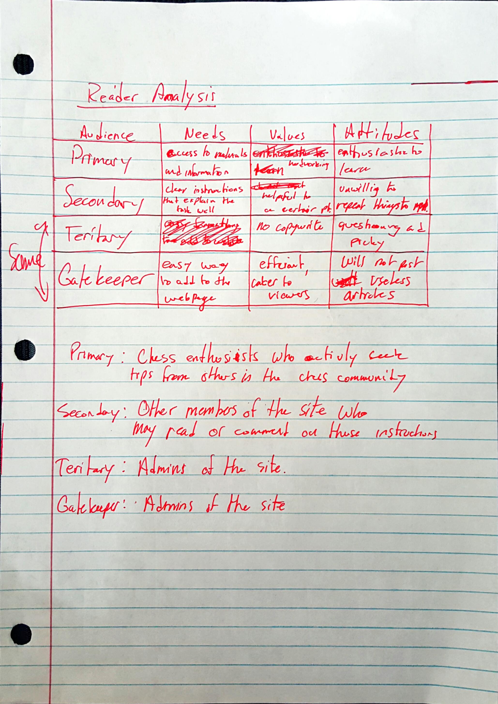
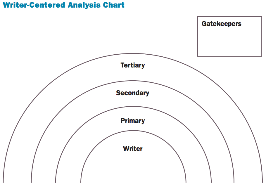
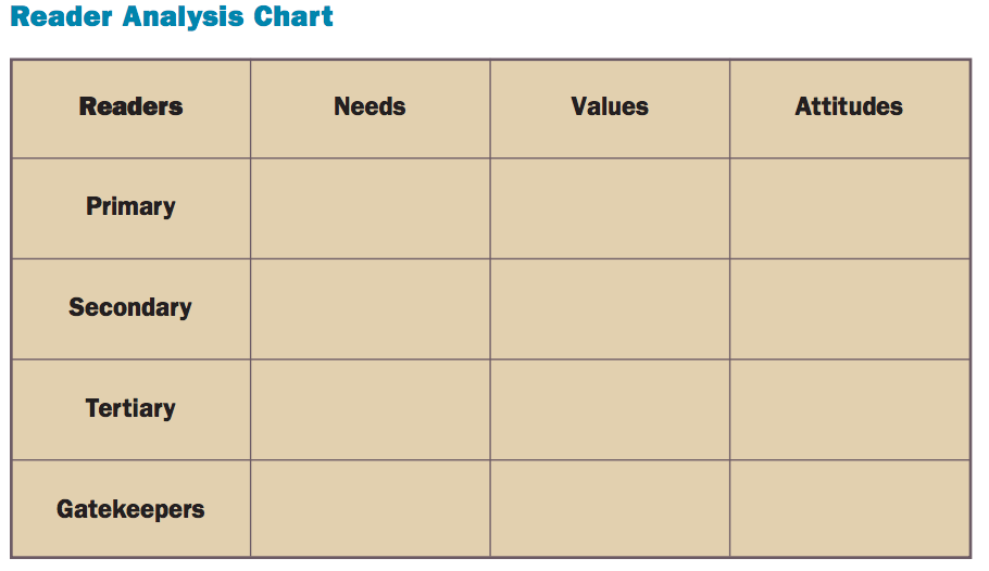
This semester in class, we were obligated to do some research on how to communicate with different audiences and how to identify them. First, we learned to profile our audiences. We looked at who they are, where they are from, and how and why they are reading this piece. Then we used this information to analyze our readers. This gives us a lot of information about them. Are they the primary, secondary or tertiary reader? When you look at the primary reader, you know that you need to write to them as if they are the ones being directly impacted by the action, while the secondary and tertiary readers may be in more of an observational role, and will have to keep other people’s’ interests in line as well. We can take this information and add it to a chart where we can more easily compare all of our readers requirements. Using these factors, we can maximize our design and information to help the readers best understand, and appreciate the work that we have done.

Our final project is to create an online portfolio to show the work that we have done this semester. We had to be mindful of the design that we used as well as the content that we included on the webpage. As I chose for it to be a professional site that I could show off to any potential employers, that we even more of a factor when I designed this page. As an engineer, my page must do a good job at showing off a lot of the different technical skills that I possess so that the employers knows I am competent in my field. Therefore, when I analyzed my audience, I looked at different professionals being my main audience, with professors or my peers being a secondary audience. I did not consider having much of a tertiary audience because this was mainly for myself, but the university could be considered in this role as they are the owners of the domain. Because my audience was employers, and I know that they are looking for a clean, simple and efficient webpage, I made mine accordingly with simple menus, and effective descriptions that would help everyone navigate around my page without getting confused or lost. I also included a lot of visuals because they make the overall appearance and presentation much more appealing to the eye as well as more inviting to read. Overall, I made it to easily showcase the talents and accomplishments that I have achieved so far in a way that would be appealing to a future employer.

Being an engineering major, we do not get enough opportunity while in school to develop our professional communication skills. That said, I have had numerous chances to improve my skills both in internships as well as extra curricular activities. One of the most important things I have learned through these opportunities is that you must be direct and clear in anything you do. Be it email, asking a question, writing instructions, or talking on the phone. Although you may understand exactly what you are trying to say, but there is a very good chance that you have left out some critical details that will prevent the person from completing the task. Spell out everything; even if it may seem trivial to you, it may not be to them. I also learned to be short and quick with questions or details because everyone is busy and no one has time, or wants to take the time to read paragraphs when the entire message could have been two sentences. For this project, I believe that I have taken a lot of what I said here into account already in my final project. The whole point is to provide good technical communication, so you should already be using all of the knowledge you have gained, not solely relying on what we learned in class.


Thank you,

Wyatt Lauer

B2- Choosing our Audiance

A lot of planning went into the design of our project. Deciding who we were targeting with our instructions was no easy task and it was made even more difficult by some of the different people we thought of. They were all very different, so we needed to select the one that we could address the best. I worked a lot on creating all of these different personas as well as a reader analysis of the situation. When thinking about this, it was made clear to me that I needed to create a very targeted audience so that I would be able be detailed enough to be useful.

Some of the work I did was pretty rough like the document to the right. They were done quickly and the main purpose was to get information on the page so that we had an idea of where to start with this project. It gave us a great reference to return to whenever we were not sure how something should be worded or whether or not we needed to include certain steps in our final presentation.


Reader Analysis


There were also a lot that went into making our personas. They were essential in how we wrote our instructions and made sure that we stayed on track with all of the requirements that were necessary in our final deliverable. They took me a long time, but I also had a little fun getting to make up people and give a brief intro to who they are in the hopes that it explains why they have certain expectations. You can see all of the different personas in the link at the beginning of this paragraph.

The reason we were able to be so efficient with this project was because we were diligent about sticking to our timeline as close as possible. Outside of the fact that it all got shifted every once in a while when the whole class changed plans, we stuck to our individual assignments really well. This is essential when you are collaborating with group of people and we couldn’t have been this successful with out a schedule. Here is a quick preview:

Screenshot 2015-11-12 13.33.19

In the end, all of the pre-design payed off because we had all the ground work laid out, so all we had to do was put the presentation together.

You can also see the assignment page here


B1- Sometimes More Is Less

The biggest takeaway from this first assignment is that more is less in many situations. This was exemplified when I found the article that I decided to remake; a memo from the head of the mobile division of Microsoft to his employees. It was terribly complicated, and did not do a good job at delivering the message that was supposed to be at the heart of the memo. When it was rewritten with the first and most important part of the article explaining the current situation, and reason for the memo, it was a much easier, and relatable letter.

I think that we can see the same story in many infographics and presentations as well. So often people try and cram as much as they can into a slide or page while not thinking about how the reader is going to react when they see it.

bad_pp

The slide above is a great example of trying to overload a slide. While it may have all the information the presenter wanted to convey, the reader will never be able to follow along because there is too many bullets to be able to read while also listening to the speaker.


This on the other hand is a much better example of how to make a slide.

11-choose-chart-type-carefully_good-example_bar-chart-rerendered-as-be-pie-charts

There is enough information, as well as graphs that give a lot of information in a visually appealing way. This slide eliminates many of the problems that come with adding a lot of text because now the reader has time to go through each point and analyze them before the speaker moves on to the next slide.

In conclusion, I believe that we need to take a minimalist approach to creating our documents. They provide all of the needed information, in a more concise and elegant package that is much more approachable to the audience.

Here is a link to the Assignment associated with this post.