B3- Visualization of Data

We went through a lot choosing the correct data, and also the correct charts to represent that data. We needed to go through a lot of different data sources to find the precise information we were looking for. A lot of it was found using Google at the beginning because it was a great way for us to get a lot of information that we could then refine later. Once we started going through the data, we noticed that a lot of the data came from government websites, or watchdog websites that keep the public informed about the energy sector. We found approximately 20 sources and then narrowed it down to the top 5 that would give us the strongest point as to why our country needs to move away from fossil fuels.

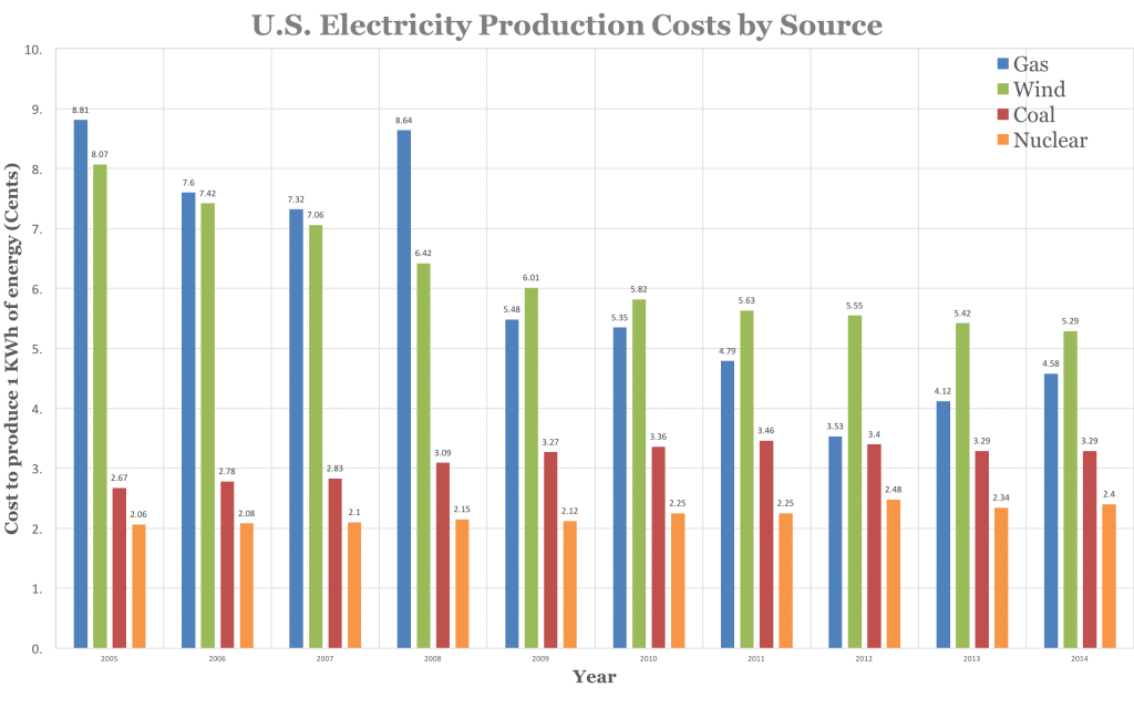
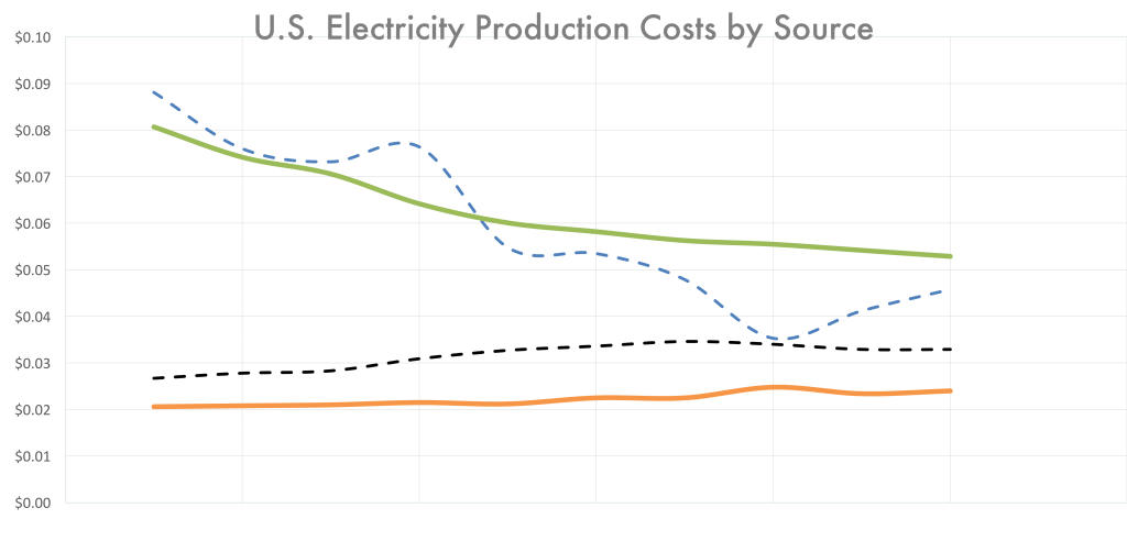
Once we got the data, we needed to choose the types of graphs to use. Originally, we used the bar graph below to represent the cost of oil, but then quickly realized that it didn’t really help our point. It showed quantities but did not adequately show the trend of the prices over time. Therefore we used the line chart because it directly shows us that trendline, and makes the advantages of the wind and nuclear very clear.

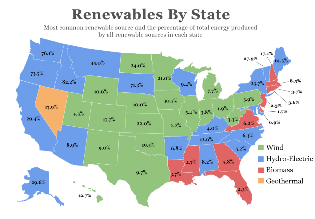
The other major graph I worked on was the chart of the U.S. There was a ton of data that we needed to get into our infographic, and that is the reason we chose to use the map. It allowed us to get two huge pieces of data into one beautiful chart. It is also something that attracts the eye so it helps interest readers in what we have to say as well, which is a great bonus from a well designed piece. 

You can also see the assignment page here.

B2- Choosing our Audiance

A lot of planning went into the design of our project. Deciding who we were targeting with our instructions was no easy task and it was made even more difficult by some of the different people we thought of. They were all very different, so we needed to select the one that we could address the best. I worked a lot on creating all of these different personas as well as a reader analysis of the situation. When thinking about this, it was made clear to me that I needed to create a very targeted audience so that I would be able be detailed enough to be useful.

Some of the work I did was pretty rough like the document to the right. They were done quickly and the main purpose was to get information on the page so that we had an idea of where to start with this project. It gave us a great reference to return to whenever we were not sure how something should be worded or whether or not we needed to include certain steps in our final presentation.


Reader Analysis


There were also a lot that went into making our personas. They were essential in how we wrote our instructions and made sure that we stayed on track with all of the requirements that were necessary in our final deliverable. They took me a long time, but I also had a little fun getting to make up people and give a brief intro to who they are in the hopes that it explains why they have certain expectations. You can see all of the different personas in the link at the beginning of this paragraph.

The reason we were able to be so efficient with this project was because we were diligent about sticking to our timeline as close as possible. Outside of the fact that it all got shifted every once in a while when the whole class changed plans, we stuck to our individual assignments really well. This is essential when you are collaborating with group of people and we couldn’t have been this successful with out a schedule. Here is a quick preview:

Screenshot 2015-11-12 13.33.19

In the end, all of the pre-design payed off because we had all the ground work laid out, so all we had to do was put the presentation together.

You can also see the assignment page here


B1- Sometimes More Is Less

The biggest takeaway from this first assignment is that more is less in many situations. This was exemplified when I found the article that I decided to remake; a memo from the head of the mobile division of Microsoft to his employees. It was terribly complicated, and did not do a good job at delivering the message that was supposed to be at the heart of the memo. When it was rewritten with the first and most important part of the article explaining the current situation, and reason for the memo, it was a much easier, and relatable letter.

I think that we can see the same story in many infographics and presentations as well. So often people try and cram as much as they can into a slide or page while not thinking about how the reader is going to react when they see it.

bad_pp

The slide above is a great example of trying to overload a slide. While it may have all the information the presenter wanted to convey, the reader will never be able to follow along because there is too many bullets to be able to read while also listening to the speaker.


This on the other hand is a much better example of how to make a slide.

11-choose-chart-type-carefully_good-example_bar-chart-rerendered-as-be-pie-charts

There is enough information, as well as graphs that give a lot of information in a visually appealing way. This slide eliminates many of the problems that come with adding a lot of text because now the reader has time to go through each point and analyze them before the speaker moves on to the next slide.

In conclusion, I believe that we need to take a minimalist approach to creating our documents. They provide all of the needed information, in a more concise and elegant package that is much more approachable to the audience.

Here is a link to the Assignment associated with this post.