The biggest takeaway from this first assignment is that more is less in many situations. This was exemplified when I found the article that I decided to remake; a memo from the head of the mobile division of Microsoft to his employees. It was terribly complicated, and did not do a good job at delivering the message that was supposed to be at the heart of the memo. When it was rewritten with the first and most important part of the article explaining the current situation, and reason for the memo, it was a much easier, and relatable letter.
I think that we can see the same story in many infographics and presentations as well. So often people try and cram as much as they can into a slide or page while not thinking about how the reader is going to react when they see it.
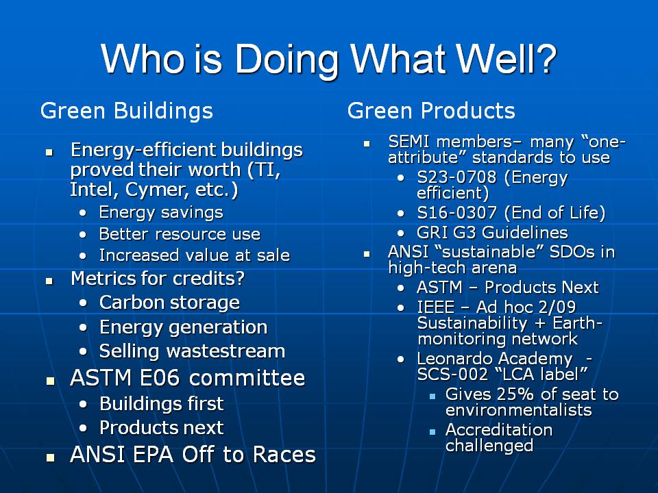
The slide above is a great example of trying to overload a slide. While it may have all the information the presenter wanted to convey, the reader will never be able to follow along because there is too many bullets to be able to read while also listening to the speaker.
This on the other hand is a much better example of how to make a slide.
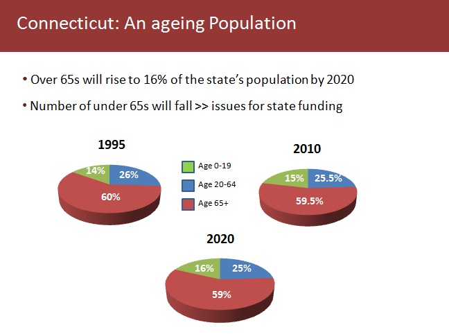
There is enough information, as well as graphs that give a lot of information in a visually appealing way. This slide eliminates many of the problems that come with adding a lot of text because now the reader has time to go through each point and analyze them before the speaker moves on to the next slide.
In conclusion, I believe that we need to take a minimalist approach to creating our documents. They provide all of the needed information, in a more concise and elegant package that is much more approachable to the audience.
Here is a link to the Assignment associated with this post.