Blog Post 3 – Graph Designs
Over the past month I worked with a group electrical engineering students to create an infographic. Our group naturally is interested in power and energy generation so we decided to make our graphic show Americans that we need more renewable energy. We did our research by finding data on the United States energy production by source every year, the amount of CO2 produced from each source and the amount of growth in renewable energy production.
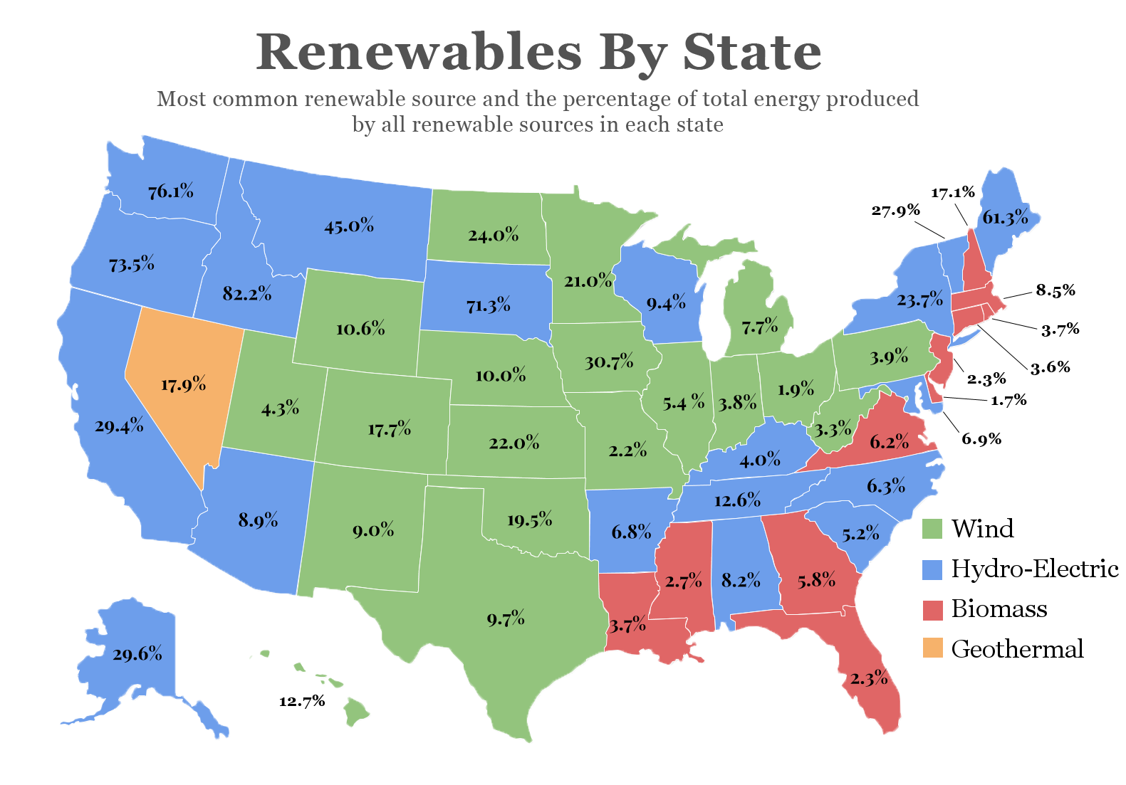
We used the energy production data from the U.S. Energy Information Administration in our graphic of the United States showing how much energy is produced by renewables as a percentage of the overall production in each state and which renewable source is the largest in each state. The intention behind the United States graphic is show how each state is doing individually, which states should work to improve their use of renewables, and how each state produces their energy.
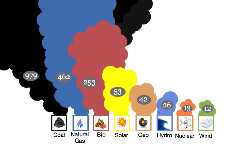
The second graphic I helped to create shows the dramatic differences in the amount of CO2 produced by fossil fuels. We used data found from the Nuclear Energy Institute to show the life cycle carbon emissions of each source. We originally presented this data using a bar chart but decided that the graphic could use smoke instead to represent the amount of CO2 each source produces to help the viewer understand how huge the amount of pollution a coal plant produces compared to a wind turbine more effectively.
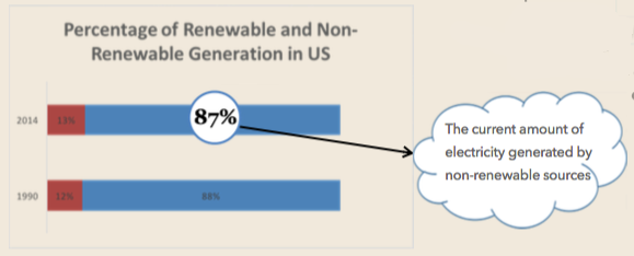
The final graphic I worked on is a bar graph that points out our lack of renewable energy production growth in America. We felt that Americans may be under the impression that United States is improving in renewable energy production because the topic has become more widely talk about in the media our data again from the U.S. Energy Information Administration shows that assumption to be invalid. As a percentage of our overall production, renewable energy only produces one more percent of America’s energy than it did in 1990. Our graphic shows Americans that we have not improved significantly in renewable energy production.
Check the entire infographic here!


